Every designer has a specialty. A look, a style, a collection of go-to shopping locations to help outfit the home and make it unique. It’s why we love reading design blogs, to see what inspires our industry colleagues and what makes them tick. Starting a blog is a entirely complex endeavor. Will we have enough time or enough to say? Its becoming quite evident however that a blog might just be a beneficial way to gather our thoughts and provide a bit of insight into who we are and why we love design.
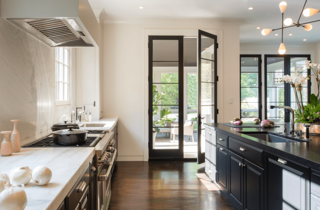
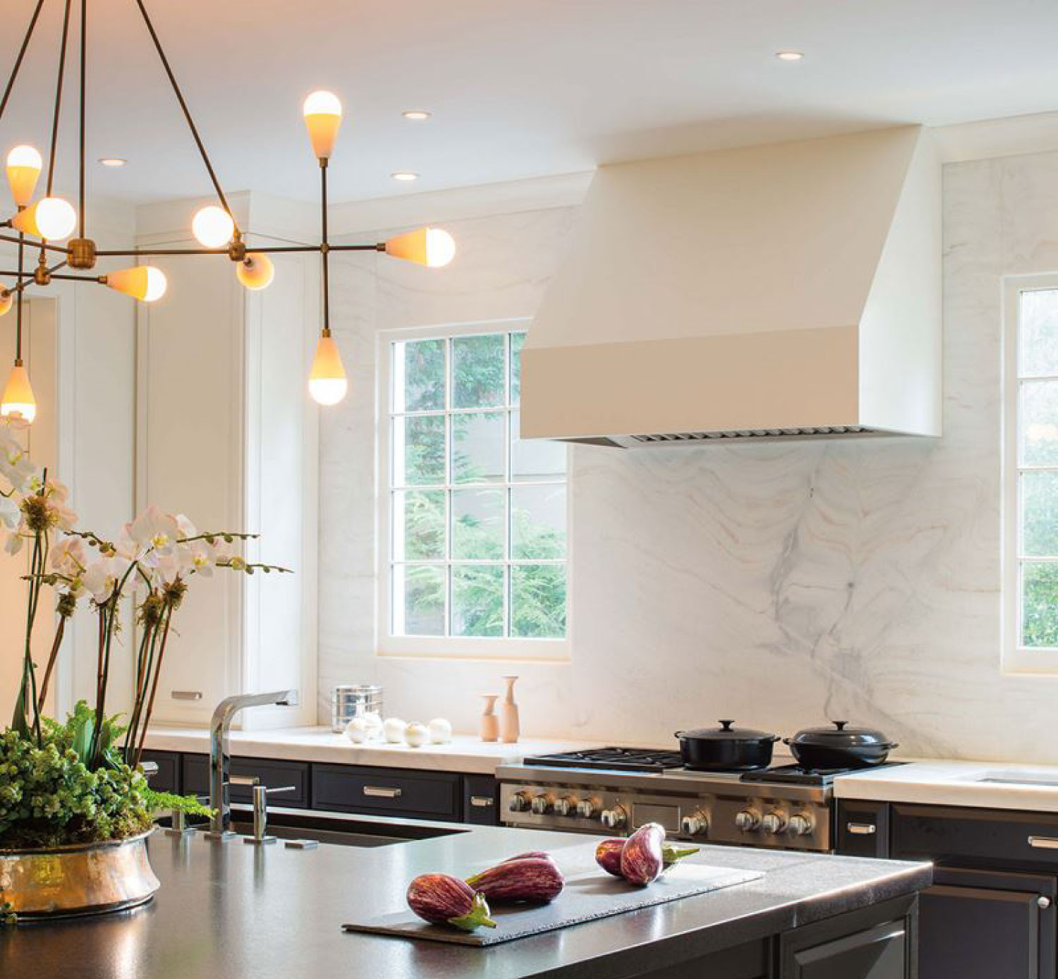
So, to kickoff our inaugural post it seemed only fitting to share a project that defines the essence of Ella Scott Design – my house! A mix of modern and traditional, curated local artwork (including my children’s own masterpieces), sculptural lighting, black & white design…and everything in between. For starters we purchased a builder grade home that lacked architectural interest and detail (something I swore I would never do.) The original kitchen, the hub of any home, was seemingly closed off from the surrounding rooms and without easy access to outside space. Not to mention the cherry floor and cabinets and green granite did not work with my design sensibility.
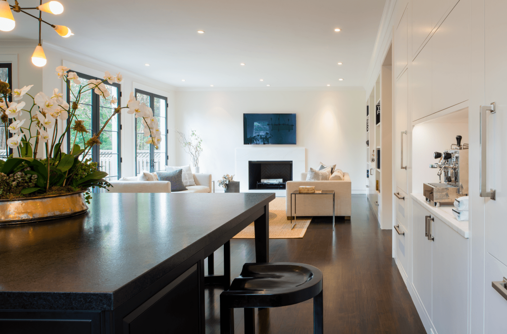
With the help of local architect and friend, Donald Lococo, we opened up the kitchen and turned the space into an multi-purpose room including a breakfast area, family room and an easily accessed screened porch.
I repurposed a portion of the original cabinets, but painted them black to give them a fresh, modern look. The remainder of the kitchen cabinets and integrated refrigerators were built into a wall that runs the length of the room and ties the spaces together. I used Benjamin Moore Onyx 2133-10 for the black and the remainder of the room – and I mean everything – cabinets, walls, crown, base and ceiling are BM Moonlight White OC-125, my go to white.
…..and what would design be without a little personalized DIY goodness (a photo from our Instagram archives).
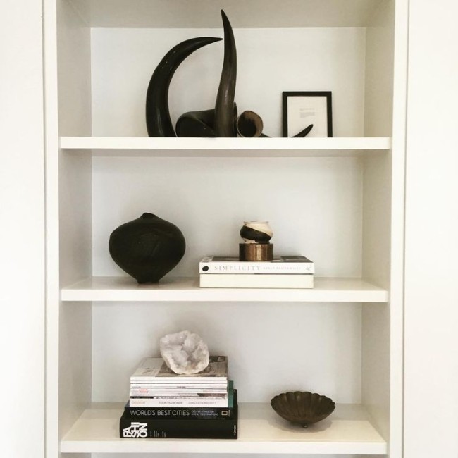
Shelfie with meaning: some items were purchased but most were found or made! A bowl my daughter made in ceramics | Black pot made by my sister-in-law (found in her trash-it’s one of my favorites) | Brass bowl from flea market | Half of a geode I found cleaning out my garage| Framed tiny menu card from trip to Austria for my 40th.
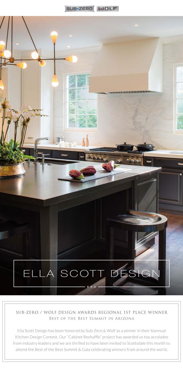
Not only do we love our home, we are excited to share that this project won Regional 1st place in the Sub Zero Wolf Kitchen Design Contest this year! Thank you Fretz and Sub-Zero Wolf for honoring our work!
We have been busy making changes to the rest of the house, so stay tuned.
Snippets of our projects can be found on Instagram or view other photos of this kitchen project here.
Thanks for reading!
-Sandra

![before after builder grade kitchen remodel cherry cabinets green granite counters [The kitchen before renovations looking towards the screened porch.]](https://ellascottdesign.com/wp-content/uploads/2015/10/meyerkitchen_Before1.jpg)
